Repository navigation
[rustdoc] issues of the three-big-buttons #132386
Description

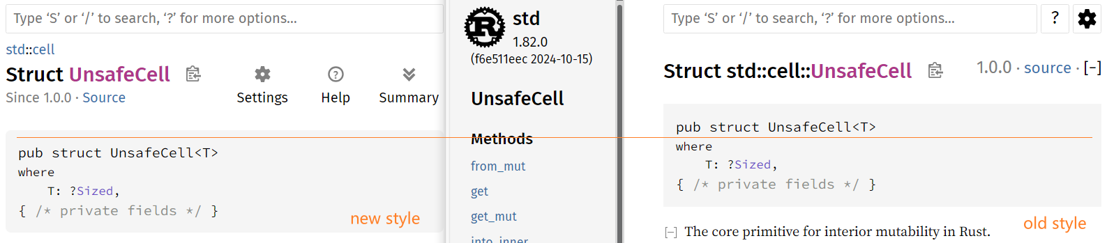
PR #129545 introduced a new style for rustdoc API pages.
I appreciate the author's efforts. But the new style still has a few shortcomings.
- It's not as compact as the old style, more than one line space in vertical is wasted.
- It does not utilize the horizontal space on search-box's right. (Are we really need a so big search box? as nearly wide as screen?)
- The icon+text button is unnecessary, there's well known icons for help/setting/folding, no text is needed here.
- The three-big-buttons may attract user's attention, and distract exploring contents.
- The top-right version+source are moved to top-left, while leaving most other version+sources at right, that makes a big UX pain.
That PR said:
The settings, help, and summary buttons are also too hard to recognize.
I don't think that's right. Gear-icon for setting, question-mark-icon for help, +/--icon for folding, are widely used all over the world, the meaning is clear. The top-right position of the window is also easy to find and reach. The search box has a tip of '? for more options' in its placehold, you may type ‘?’ key to 'click' the help button. There's document in help page to help you find folding button. That's enough, for those low utilization rate buttons. Folding (aka summary) button's icon may use a different color to improve recogniztion.
That PR made those buttons very big, bigger than any other items of the page. That's an UX issue too (as i said above).
I propose:
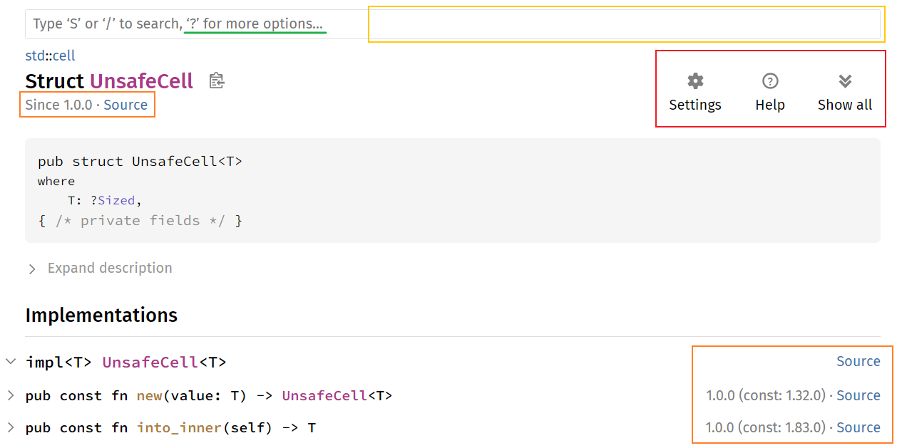
- Make the three-big-buttons smaller, by removing text (and add tooltips), and move them to right of search-box.
- Move top-left version+source back to top-right (below the new three-icon-buttons).
- Change color of folding-button's icon to improve its recogniztion.
- Change order of the new three-icon-buttons: help, setting, folding.
- Improve help page: to match collapse/expand vs summary/show-all vs folding/unfolding.
Activity
Urgau commentedon Oct 31, 2024
cc @notriddle @GuillaumeGomez
notriddle commentedon Oct 31, 2024
But the PR links to the first- and second-hand reports of several people who didn't recognize them. Here they are again, with quotes extracted from the text this time.
notriddle commentedon Aug 21, 2025
Fixed by #144476
liigo commentedon Aug 21, 2025
Now there're four big buttons.